CSS Box Model differences in Firefox and Internet Explorer
Multithreaded JavaScript has been published with O'Reilly!Problem:
Here is the bane of web developers existence, Internet Explorer incorrectly displaying the CSS box model. What is the box model? This describes all elements used in HTML documents. Every element is in the shape of a rectangle (and you wonder why developers cringe when circles are a part of layouts?) A box has several attributes to it, such as width, height, padding, margin, and border.
Margin is the space outside of the box, padding is the space inside the box to come in contact with elements inside of it, width is the width of the box, height is the height of the box, and border is a line that is on the outside of the box between the margin and the padding. It seems like a simple concept doesn't it?
Except, there is one small problem. Firefox and other standards complient browsers will add the size of the padding to the width or height of the box, while Internet Explorer will simply place the padding inside of the box without adjusting the width or height. Personally I like the way IE does it more, however this goes against the rules put in place by the W3C.
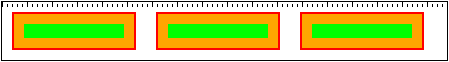
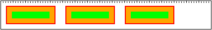
Below, in both the Firefox and Internet Explorer categories, I've first displayed how the browser interprets the box model, then display a screenshot in the browser. The lines are separated by 5 pixels, and each large line represents 25 pixels. Here is the code used to render each image:
<style>
* {
font-family: verdana;
font-size: 12px;
}
.outer {
margin: 10px;
border: 2px solid red;
padding: 10px;
background-color: orange;
float: left;
width: 100px;
}
.inner {
background-color: lime;
}
</style>
<div style="border: 1px solid black;">
<div class="outer">
<div class="inner"> </div>
</div>
<div class="outer">
<div class="inner"> </div>
</div>
<div class="outer">
<div class="inner"> </div>
</div>
<div style="clear: both;"></div>
</div>
Firefox:
border                                  border
   |<- padding -|   content   |- padding ->|
                |<-- width -->|
Internet Explorer:
border                                  border
   |<--------------- width --------------->|
   |- padding ->    content    <- padding -|
What this means is that in FF, if you create a box that is 400px wide, and has a padding of 10px and a margin of 10px, it will actually end up being 440px wide total. In IE, if you create the same box, it will be 420px wide total. This is a very annoying problem because this is the most simple building block to creating any CSS/XHTML based website layout, and the two competing browsers treat these items differently.
Solution:
The solution for this problem is a simple (albeit hacky) fix. Place one element inside of the other, where your outside (container) element does not have any padding but has a width defined, and the inside element does have padding defined. The reason this is considered a hack is because we have to add twice the markup to our webpages to get the same effect rendered correctly in both browsers.
Thomas has contributed to dozens of enterprise Node.js services and has worked for a company dedicated to securing Node.js. He has spoken at several conferences on Node.js and JavaScript and is an O'Reilly published author.