Tips for Building Mobile Games in HTML5
Multithreaded JavaScript has been published with O'Reilly!There are a myriad of native mobile game engines available today, JavaScript will never be as fast as a game running compiled code, and simply running a game in a browser provides a lackluster user experience. That said HTML5 is still a powerful and free platform that you may already be proficient in, and if written correctly, HTML5/JS can be more than adequate for many mobile game titles.
Browsers were built with convenience in mind for users who browse content-based websites and who hop around different URLs or scroll through pages of content. Examples of these conveniences include displaying a navigation bar, allowing text selection and copying, navigating through history via swipes, and zooming in and out of content. Much of the advice in this article involves the removal of these conveniences and limiting / fine tuning what the user can do with their browser.
Development and Debugging
If you're using Google Chrome, the developer (Cmd+Shift+I / Ctrl+Shift+I) tools has a button next to the element selector which enables mobile mode. Click that then select a device preset from the dropdown menu. This'll set the same resolution as the device (with scaling/high DPI caveats) and even spoof the user agent. Each time you change the device you'll want to refresh.
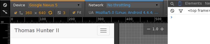
In this mode your cursor is not so much a cursor as it is a finger. Click and drag on the screen and you're scrolling. Sometimes you will notice scrolling with your mouse doesn't work either (this might be a bug, I'm not sure). Also, if you're using jQuery UI, you'll notice that some click events stop firing as you're now triggering touch related events (a fix for this is explained later).
Another debugging feature this offers is the ability to throttle your network connection. The biggest use of this is of course simulating slow network speeds and understanding how the application will feel for your users. This is also a great way to discover if there are any race conditions in your game code caused by assets being downloaded slower than anticipated.
One thing to keep in mind is that this tool doesn't actually emulate the browser rendering engine of the phone your game will run. If your game runs on Android it'll mostly be the same Chromium engine. If your game runs on iOS, it'll be rendered by Safari WebKit. On Firefox OS it'll be Firefox Gecko. On Windows phone it'll be rendered by little angry trident-wielding demons. I don't use (nor have access to) the latter two platforms so I won't be mentioning them from here on.
Fullscreen
When running your game in a web browser, iOS has an annoying navigational bar which is always visible, and both Android and iOS have a navigational bar which displays based on the users scrolling of your page. Swiping right and left in iOS will bring up some annoying arrows intended to help the user browse through history. To remove this you can add a pair of meta tags to your HTML document and have the user add your application to their Home Screen:
<meta name="apple-mobile-web-app-capable" content="yes" />
There's a library out there called Add To Homescreen which provides a popup guiding the user to add your game to their Home Screen. Unfortunately the author doesn't realize this is applicable to Android as well (upper right instead of lower left, and ignores Android user agent), but c'est la vie.
Note: Even if a user adds your application to their Home Screen it will not remove the clock and top bar icons on iOS and Android, or the OS navigation buttons on Android. For this you'll need a pseudo-native application wrapper mentioned at end of this document. On the up-side, we do have some control over how the bar will look:
<meta name="apple-mobile-web-app-status-bar-style" content="black" />
Home Screen Icon
Despite all of the apple-touch prefixes below, these are actually acknowledge by both iOS and Android. When the user adds your application to their Home Screen it will be this icon the user will tap to launch your game. If you don't use these meta tags, Android will default to using your Favicon while iOS will take a screenshot and use that.

Both OS's will prompt the user for an application name, defaulting to the page title. Note: You'll want to use the apple-mobile-web-app-capable meta tag above for these to work.
<link rel="apple-touch-icon" href="icon-66.png" />
<link rel="apple-touch-icon" sizes="76x76" href="icon-76.png" />
<link rel="apple-touch-icon" sizes="120x120" href="icon-120.png" />
<link rel="apple-touch-icon" sizes="152x152" href="icon-152.png" />
Notice that the example meta tags include not one but four different icon resolutions! As the DPI in our phones gets larger and larger the required icon sizes do as well. The OS should pick either the exact icon or the closest approximation for being displayed on device with minimal stretching. When designing your icon don't add any rounding of edges or glossy effects, iOS will add that for you. Android will also tweak the icon so that it appears nicely on the users Home Screen.
There is also a startup image iOS will supposedly display as your game is launching (without setting this it'll use either a white screen or the last screenshot it grabbed from your game). It has never worked for me though so your mileage may vary:
<link rel="apple-touch-startup-image" href="startup.png" />
Click Lag
There's a 300ms delay between when a user clicks an anchor or form submit on a mobile browser and when the browser will acknowledge it. This is done to enable double tap (zoom) detection and can leave a game feeling laggy. If you know what you're doing (e.g. you don't want page zooming) you can opt to remove this lag. By listening for the click event on anchors or buttons and performing the action programmatically you can skip the delay.
Chances are that if you're building a Single Page Application game this lag won't affect the users experience too much (why would you have an anchor in a game?) Just keep in mind that some built-in browser events can be delayed by 300ms and why it happens.
Note: If you enable the following zoom prevention feature the 300ms lag should be removed on Android.
Disable Zooming
Zooming into the document using double taps or two finger spread gestures, while perfectly reasonable for a website, will ruin many a game experience. Thankfully it can be disabled with the following meta tag:
<meta name="viewport" content="width=device-width, initial-scale=1,
  maximum-scale=1, user-scalable=0, minimal-ui" />
The viewport is the “window” the user looks through to see your page. This viewport is basically the size of their phone screen. The viewport can be larger or smaller than the webpage itself, as well as being panned around. This tag basically tells the browser to set a viewport with a 1:1 ratio of logical pixels to device pixels. By using variations of this tag you could force the device to use a specific pixel width and height, but after much experimenting I find it easier to use device-width.
Of course, by preventing zooming and panning, you will need to ensure your game scales and looks properly on a wide set of devices.
Disable Text Selection
Text selection should probably be disabled for your game (though enable it where needed such as form input elements and large bodies of text). If enabled the user can get annoying text selection popups while interacting with your game. An example of this annoyance would be if you're listening for long presses on an element, where the user could get a text selection popup before the event fires.
body {
  -webkit-user-select: none;
  -moz-user-select: none;
  -ms-user-select: none;
  user-select: none;
}
p, input, textarea {
 -webkit-user-select: text;
 -moz-user-select: text;
 -ms-user-select: text;
 user-select: text;
}
Drag and Drop
Drag and Drop is an excellent way to add interactivity to your game. A combination of jQuery, jQuery UI, and jQuery UI Touch Punch will allow you to set elements as being draggable, others as droppable, and execute callbacks when they occur. jQuery provides us with a selector engine and a plugin system. jQuery UI provides us with some excellent interaction (read the Draggable and Droppable pages for details). jQuery UI Touch Punch changes how jQuery UI works so that it treats press events as click events where applicable.
<script src="/scripts/lib/jquery.min.js"></script>
<script src="/scripts/lib/jquery-ui.min.js"></script>
<script src="/scripts/lib/jquery.ui.touch-punch.min.js"></script>
Keep in mind when designing UI that whatever elements you enable dragging on cannot also be used for scrolling purposes as that would start a drag.
Simple Finger Interaction
jQuery Finger extends jQuery to provide events for tap, doubletap, press, drag, and flick. These events can even be used via event delegation. The long press event is the one I like the most, and flick sounds pretty useful too. With the jQuery UI Touch Punch plugin mentioned above, tap and doubletap should simply be synonymous with the normal click and dblclick events provided by jQuery.
$('.character').on('press', function() {
  console.log('long press activated');
});
The drag event is nice for triggering basic events, but if you want to know where the element is being dropped, I recommend using jQuery UI instead (mentioned above).
Advanced Gesture Interaction
For more advanced interaction from the user, such as pinch and rotate detection, check out Hammer.JS, which is a standalone JavaScript library. Overall it offers more features than Finger does, though it may take additional effort to implement into your project. If you would like to use Hammer with jQuery they do offer an official jQuery plugin.
var character = new Hammer(document.getElementById('character'));

character.on("pinch rotate tap press", function(ev) {
  console.log(ev.type + " gesture detected.");
});
Scrollable UI
Perhaps you've got a large portion of the game that you want to be scrollable (such as a battlefield) and you want other parts of the game to not scroll and remain on screen (such as toolbars). This can be achieved by setting toolbar positions to fixed and letting the battlefield be a normal element larger than the screen:
header, footer {
  height: 50px;
  position: fixed;
  width: 100%;
  z-index: 1000;
}
footer {
  bottom: 0px;
}
When doing this the browser will simply treat the overflowed content the same way it would any webpage and allow it to be scrolled.
However, you may not want to be able to scroll the battlefield by dragging from the fixed toolbars as this would be a confusing experience for the user. To disable scrolling from specific elements we can intercept some of the touch events when originating from toolbar elements:
var blockScroll = false;

$(window).on('touchstart', function(e) {
  if ($(e.target).closest('header, footer').length == 1) {
    blockScroll = true;
  }
});

$(window).on('touchend', function() {
  blockScroll = false;
});

$(window).on('touchmove', function(e) {
  if (blockScroll) {
    e.preventDefault();
  }
});
Note: When you have fixed elements displayed on the screen and a scrollable element such as a battlefield, you'll want to set the margins of the scrollable battlefield to be the same as the toolbars. As an example, if a footer toolbar on the bottom of the screen is 50px tall, you'll want a margin-bottom on the gamefield element of 50px.
Element Scrolling with Momentum
Sometimes you want to have a specific element within a section of your screen to be scrollable. When you enable scrolling of an element using the overflow properties the element might not have the momentum users expect (seems to vary between iOS and Android). Luckily we can enable this momentum on a per-element basis:
.scrollable {
  overflow-y: scroll;
  -webkit-overflow-scrolling: touch;
}
Tapping a Grid-Based Gamefield
If your user taps on a grid-based gamefield and you want to calculate the coordinate of the cell being tapped, you can figure it out using some simple math. First off, if your gamefield has any sort of CSS margin you'll need to subtract it from the click event. After that calculating the coordinate is as easy as dividing the X/Y touch pixel coordinates by the size of each gamefield cell.
This is especially useful for canvas based gamefields where there aren't DOM elements you can use for click detection.
var $gamefield = $('.gamefield');
$gamefield.on('click', function(event) {
  var offset = $gamefield.offset();
  var x = Math.floor((event.pageX - offset.left) / TILE_WIDTH);
  var y = Math.floor((event.pageY - offset.top) / TILE_HEIGHT);
});
This isn't a mobile-specific method for getting coordinate locations, but it's useful to know nonetheless ;).
Event Delegation
If you ever have a lot of similar elements you want to interact with, use jQuery event delegation. As an example, if someone clicks on a table-based gamefield, don't have a listener on every table cell, instead have a single listener on the entire gamefield.
The more event listeners you have, the more memory your game will require, and the more CPU cycles which will be burned both enabling them and looking them up when an event happens.
Keep Truth out of the DOM
This applies for desktop web development as well. Don't do lookups on events and throw everything into data-* attributes. It's especially important on Mobile where the CPU isn't so awesome. You should especially never query the DOM during your core game rendering loop as that'll kill framerate.
ReactJS is a modern View rendering framework which does a good job of preventing developers from putting truth into the DOM. It also does some cool performance optimizations behind the scenes to reduce the amount of work required for updating the DOM which can really help on Mobile. I don't have any React code in production though so I can't speak to its awesomeness just yet.
Canvas
Canvas is a fairly low level, yet powerful tool for rendering graphics in HTML5. It renders to a single DOM element which reduces overall overhead. This also has the feature/side effect that you cannot, say, click on one of two squares you've drawn and know which one was clicked.
When rendering to the canvas you should redraw the entire canvas instead of small parts. Most games already do this where each frame of animation involves a complete recalculation of objects and complete redrawing. If you were to draw a red rectangle then later a white rectangle at the same location, iOS would leave a tiny sliver of red behind due to the way it handles high DPI “Retina” rendering. The canvas is actually stretched in a way that you can't address every single canvas pixel.
To get around the issue of not being able to control every pixel, some guides say to double the size of your canvas then shrink it using CSS. I haven't tried this myself but the idea is sound. One thing to keep in mind is you're now quadrupling the drawing surface which will slow down rendering.
Device Sniffing
Sometimes you need to overcome platform limitations. In iOS for example, sliding your finger from an edge opens a menu and interrupts the game. If you know that your user is on an iOS device, you could move items away from the edge using CSS.
if (/(iPad|iPhone|iPod)/g.test(navigator.userAgent)) {
  $('body').addClass('ios');
}
CSS Media Queries
Since your game will need to run on a cornucopia of Android and iOS devices, you'll want to adapt to different resolutions. I recommend reading up on CSS Media Queries and experimenting with your UI until you come up with a scaling UI which makes every device happy.
@media (max-width: 600px) {
  .selector {
    width: 300px;
  }
}
As with most CSS selectors, develop some base attributes which works everywhere, then come up with some specific fallbacks. In this case you may need a few fallbacks for each different range of device screen widths.
You can also use Media Queries to detect device orientation:
@media all and (orientation: portrait) {
  body {
    background-color: red;
  }
}
@media all and (orientation: landscape) {
  body {
    background-color: lime;
  }
}
Getting Viewport Resolution
Modern (mobile) browsers provide a global variable called screen. The two properties you're looking for are availHeight and availWidth. Here's a JSON representation of the screen object in my browser:
{
  "availHeight": 640,
  "availLeft": 0,
  "availTop": 0,
  "availWidth": 360,
  "colorDepth": 24,
  "height": 640,
  "orientation": {
    "angle": 0,
    "onchange": null,
    "type": "landscape-primary"
  },
  "pixelDepth": 24,
  "width": 360
}
If you would like to fire an event when the user rotates their device check out this Solution on Stack Overflow for details. Essentially, most mobile browsers will fire a orientationchange event, and you can also fall back to the standard resize event.
There unfortunately isn't a way to prevent the user from changing their device orientation like there is with a native application. This is another feature which makes sense from a web browsing POV but hinders game development. See the section on pseudo-native below for workarounds.
Audio Playback
Unfortunately HTML5 Audio Tag playback on a mobile device is a broken experience at best. The reason for this limitation is to prevent evil websites from abusing users, but it is unfortunate nonetheless.
Audio can be directly triggered by user input, which is useful for playing a sound clip when your character jumps, but not so useful for playing a sound clip when an enemy shoots your character. What this means is if you call the play() method on an audio clip as a result of listening for a user triggered event the audio will play. If you were to add a setTimeout() to delay audio playback it would not fire as this is a different stack.
This can be circumvented by going pseudo-native (explained below) and using a different audio API, but unfortunately there doesn't seem to be a pure HTML5 solution.
There are also a whole slew of audio filetype compatibility considerations to be had (WAV vs MP3 vs OGG). The MDN has a browser Media Compatibility Table (for desktop AND mobile) which will guide you through which formats to support.
Pseudo-Native Apps
A discussion on HTML5 game development just wouldn't be complete without mentioning ways to build a more “native” experience. There are different tools that you can use for running your game on a native device which will help overcome many of the shortcomings outlined in this document. A common theme amongst these tools is that your HTML5 application will be wrapped in native code and a proprietary JavaScript API will be provided for performing interactions with device API's.
The two most popular tools in this space are Adobe Phonegap, which is itself a tool built on Apache Cordova. Phonegap offers some niceties and convenience which Cordova doesn't have (e.g. some build stuff), and both are free to use (though Phonegap has some enterprise things you can opt to pay for). I personally prefer to use Cordova as a lover of all things open source and despiser of all things corporate ;).
Using these tools require that an application be compiled and signed for different target platforms. This means you'll need to use some free tools to compile Android, and a Mac + Xcode + $100 / year developer license to compile for iOS. Once compiled, it is easy to get your APK file to your Android phone to run your game, it's even easy to send this file to your friends! With iOS there are a few more hoops to jump through.
Configuring your computer to use these tools and being able to produce builds for all major platforms can be quite the undertaking.
Some of the shortcomings in this document will be made moot by using a pseudo-native tool. If an Audio API is provided you can use that for playing sounds whenever. Setting an icon and splash image is usually pretty easy. Locking screen orientation is also something you can enable. Reading and writing to the filesystem and taking pictures works too. Device sniffing code can be removed as they provide simpler methods for loading CSS and JavaScript depending on platform.
Thomas has contributed to dozens of enterprise Node.js services and has worked for a company dedicated to securing Node.js. He has spoken at several conferences on Node.js and JavaScript and is an O'Reilly published author.
news.ycombinator.com